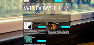
Above is a screenshot of our final website.
We created this website through a free online service called Wix. They allow you create your own free website which is hosted on their servers. It won't carry a domain name e.g. Www.example.com but instead follows the format; www.wix.com/blackdragon1994/mixy. This is due to it being hosted on their servers so it carries their name.
The Wix method of creating a website is a very user-friendly, sandbox style. To implement anything we desired was clearly labelled and easily accessible. Thanks to this we were able to create a professional, sleek looking website without the hassle of coding, etc!
Our website developed through multiple attempts and rough edits, discussion and audience feedback. We created our initial website from scratch, which was very difficult and looked very unprofessional, bland and basic. We presentated it to Mixy and he approved of the layout but agreed with us that the design required more development. We continued to experiment but unfortunately could not achieve the results we wanted. This is when we switched to Wix.
The choices we made in designing the website however were very well thought out and each object has a specific purpose. For example, we have kept the font used the same throughout our production, both in the video, digi pak and the website. This was to create familiarity and for the products to show resemblance to each other allowing them to be easily associated with one another.
Because the main focus of our production is the featured song, just a single track not an album we made sure the most noticeable title on the website was the name of the track. The name of the artist we made smaller but in bold so it still stands out against the rest of the page. We placed this above the name of the track as it follows codes and conventions to have the artists name first.
We chose a simplistic, clean theme to our website, so it still looks professional and sleek whilst remaining uncluttered and easy to navigate for users. The theme carries meaning to the selected track. The background chosen is of one of the photos from our digi pak (The rear image). Also it is a picture of a windowsill linking into the track, and is from a location within the video. Through the use of this we have successfully linked all three products together. However, we also chose the image as we felt its gentle nature helped create the 'cool' calm look we was going for. We matched the text and overall colour scheme for the website around this to create gentle blending making it look very appealing. The photo is also 'empty' which provides zero distraction to the audience.
The navigation bar also follows the simplistic manner, with the navigation buttons becoming highlighted by blue when you roll your mouse over them, again matching the colour scheme but also provides effective functionality without being 'in your face'.
The website follows the standard codes and conventions of a music/artist's website by featuring the artists name, content directly relevant to them such as pages of 'About' providing information on the artist, a page of their albums, showing off their music and a contact page.

All the links on the website are fully functional, leading to pages with content. Whilst this was not required we went ahead and did it to give our website a more completed feel. One of the buttons leads to a page called "Albums". This provides working download links to each of Mixy's available albums, we also included this on the main page, as an extra touch.
We made our music video production the main feature of the front page, as this is what the website was about and formed around. Having it placed in the centre of the main page makes it the first thing seen by the audience, it is also set to auto-play. This was done to make sure it was the main focus of the audience visiting the page.
Overall, we are very happy with our website and how it has turned out. We feel that through the choices we made in theme, features and functionality that it effectively achieved the intended purpose of being nice to look at, informational and entertaining.

No comments:
Post a Comment