Labels

Showing posts with label Construction. Show all posts

Friday, 27 April 2012

Digi Pak

Our Digi Pak is based upon the Metallica - Unnamed Felling limited edition CD case (Digi Pak). it consists of three panels and two sides, based upon this layout we had to create 10 photo/images to fill these panels we have used some duplicates; for example the sides of the case (the hinges) are both the same image. this is a simple design a white background with "Mixy Windowsill Limited Edition" wrote in the same font that goes throughout our project, Helvetica italic.
Inside of the Digi Pak Middle-CD Holder
CD design

Left-Middle flap Middle-Back cover Right-Front cover
The inside consists of five panels two sides a middle and then the hinges. however, these panels are sections of the same one image, this gives it a nice consistent horizon going across the whole inside. this has a nice simple look that is interesting to look at but doesn't have too much going on to distract the viewer. we have also included a sample of what it might look like to have some of the lyrics printed on the inside; using the chorus of the song. we have also created a CD that goes along with the internal panels. the CD's image is the same as the image behind it; this is a very common lay out for digi paks. we have also intentionally used an image with the coffee cup, from the front cover; placing the word "Windowsill" in the middle so as it will fit onto the CD.

if i were to improve upon it i would probably take the photo slightly wider so that when the image is cropped, the cup appears in full. i would also remove the white strip around the middle hole and replace it with the rest of the image that is being obscured. this would allow people to read Windowsill better however, if the image was wider this may resolve the issue. i think that wen taking the photos for the: front, back and side i think i would use a tripod. this would allow to get identical looking images whilst only changing the objects in the frame.

Tuesday, 17 April 2012

Mixy's Final Website


Above is a screenshot of our final website.

We created this website through a free online service called Wix. They allow you create your own free website which is hosted on their servers. It won't carry a domain name e.g. Www.example.com but instead follows the format; www.wix.com/blackdragon1994/mixy. This is due to it being hosted on their servers so it carries their name.

The Wix method of creating a website is a very user-friendly, sandbox style. To implement anything we desired was clearly labelled and easily accessible. Thanks to this we were able to create a professional, sleek looking website without the hassle of coding, etc!

Our website developed through multiple attempts and rough edits, discussion and audience feedback. We created our initial website from scratch, which was very difficult and looked very unprofessional, bland and basic. We presentated it to Mixy and he approved of the layout but agreed with us that the design required more development. We continued to experiment but unfortunately could not achieve the results we wanted. This is when we switched to Wix.


The choices we made in designing the website however were very well thought out and each object has a specific purpose. For example, we have kept the font used the same throughout our production, both in the video, digi pak and the website. This was to create familiarity and for the products to show resemblance to each other allowing them to be easily associated with one another.
Because the main focus of our production is the featured song, just a single track not an album we made sure the most noticeable title on the website was the name of the track. The name of the artist we made smaller but in bold so it still stands out against the rest of the page. We placed this above the name of the track as it follows codes and conventions to have the artists name first.

We chose a simplistic, clean theme to our website, so it still looks professional and sleek whilst remaining uncluttered and easy to navigate for users. The theme carries meaning to the selected track. The background chosen is of one of the photos from our digi pak (The rear image). Also it is a picture of a windowsill linking into the track, and is from a location within the video. Through the use of this we have successfully linked all three products together. However, we also chose the image as we felt its gentle nature helped create the 'cool' calm look we was going for. We matched the text and overall colour scheme for the website around this to create gentle blending making it look very appealing. The photo is also 'empty' which provides zero distraction to the audience.
The navigation bar also follows the simplistic manner, with the navigation buttons becoming highlighted by blue when you roll your mouse over them, again matching the colour scheme but also provides effective functionality without being 'in your face'.

The website follows the standard codes and conventions of a music/artist's website by featuring the artists name, content directly relevant to them such as pages of 'About' providing information on the artist, a page of their albums, showing off their music and a contact page.
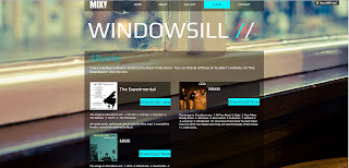
All the links on the website are fully functional, leading to pages with content. Whilst this was not required we went ahead and did it to give our website a more completed feel. One of the buttons leads to a page called "Albums". This provides working download links to each of Mixy's available albums, we also included this on the main page, as an extra touch.

We made our music video production the main feature of the front page, as this is what the website was about and formed around. Having it placed in the centre of the main page makes it the first thing seen by the audience, it is also set to auto-play. This was done to make sure it was the main focus of the audience visiting the page.

Overall, we are very happy with our website and how it has turned out. We feel that through the choices we made in theme, features and functionality that it effectively achieved the intended purpose of being nice to look at, informational and entertaining.

Saturday, 14 April 2012

Final Video and Analysis


Above is our final cut of our music video production.
The video opens with a scene of 'The Girl' played by Zarina Rogalla and 'The New Guy' Played by myself meeting up, they then enter a car. This is to establish that they are together/familiar with one another. This also acts as an establishing shot/introduction.
We then cut to a shot of a CD labeled with "Mixy - Windowsill" into a CD Player, and this is where the music starts.
A film burn transition then follows into the introduction sequence of the characters. 'The New Guy' and 'The Girl' are introduced within the same car together, driving. This is to keep continuity as they was previously seen entering the car. The character of 'The Ex' is then introduced. In this shot he is seen smoking and with an angry look on his face, this was done to fit in with the fact he is the ex and is hurt/angry by what has happened. Thanks to these titles and what is contained within the shots, the audience can immediately grasp what the narrative is going to be about.
The track is introduced not by a title but by the name of the song written onto a coffee cup in a location where a lot of the later shots happen. This is because the coffee cup is featured highly throughout the video and carries significance.
We move onto another shot of 'The New Guy' and 'The Girl' together. They are seen smiling walking out of a lift and 'The New Guy' has his arm around 'The Girl' This is to further show that they are together and happy.
We cut into a shot edited with de-saturation to provide a washed out look of 'The Ex' smiling with an un-seen character, this creates enigma. He is also seen to be pointing to the sky, this links the lyrics in with the video due to the lyric saying "There was a time when our limit was the sky". This also provides suggestions as to who the person he is with might be. It then immediately cuts to Mixy to establish that he is the person singing.

The video fades to white here in an attempt to show that the de-saturated footage is memories. We see a shot of 'The Ex' and 'The Girl' together picking out some flowers. This cuts in and out of colour and them being together and the 'The Ex' being on his own. The shot of 'The Ex' purchasing the flowers is there to represent that due to the couple sharing a moment (shown in one of the clips) with these flowers he is longing to go back to that moment.
The footage moves onto 'The New Guy' and 'The Girl' walking together. 'The ex' however is standing in the background and both characters are oblivious to this. He is seen holding the flowers but once the characters walk past he lowers them, representing how his emotions just dropped.
More memory footage occurs of 'The Ex' and 'The Girl' together. The shots are linked in with the lyrics such as “Text your number and you came for a drink call it a date we sat down had a chat and it was great in the quiet little place I grew accustomed to your face” we used footage of ‘The Ex’ and ‘The Girl’ sat together in starbucks, coffee cups visible, talking, smiling and having a nice time. Also for the “grew accustomed to your face” we had a close up on ‘The Girl’s face. All this was done to develop more memory scenes between the two characters and to link the lyrics in with the video. All this is mixed in with shots of Mixy singing to show that Connor playing ‘The Ex’ is symbolising Mixy.

Returning to where ‘The Ex’ saw the other two characters walk by together, we switch to a shot from behind ‘The Ex’ and see him walk away. There is a low down shot of ‘The Ex’ walking away throwing the flowers towards the ground and since the flowers were symbolising a moment between ‘The ex’ and ‘The Girl’, throwing the flowers to the ground represents the rejection and loss he has just experienced.
We now move to a long sequence of clips featuring Mixy rapping. This was to spotlight him as an artist and his talent. It mainly focuses on showing off his ‘flow’ in his words. This is following the codes and conventions of a standard music video by showing off the star.
He also says the lyrics “finger-tips slip on the glass”, for this we had Mixy gently run his fingers across the glass of the window he is sat next too, to link the lyrics in with the video again.

There is a shot of ‘The Ex’ in the same location that him and ‘The Girl’ had been sat in the memory scene only this time he is by himself. This shows how he is reminiscing about the past and how he yearns for them times back. He is seen twiddling a flower. This was placed as we intended for the flower to carry the representation of their relationship. He gently caresses the flower as if it was the girl. This links back to the scene of them together in the coffee shop when he caresses her face. The footage pans up to ‘The Ex’ as he takes a drink of his coffee. This then fades into a shot of Mixy finishing off the exact same action. This is to further show how Connor playing ‘The Ex’ is representing Mixy throughout the video.

The end of the video comes to footage of The Ex’ walking aggressively towards the edge of a roof, suggesting that he’s given up and is going to jump and end his life. When he reaches the railings however, we cut to Mixy in the same position. He twiddles the flower over the edge as the song draws to a close. Diegetic sound fades in as the flower is dropped from the roof, signifying the end of the song and since the flower carried the representation of the relationship, the end of that too. The use of diegetic sound for this part of the clip was to add to the feeling of everything being over.

A title sequence of credits begins whilst the track is re-started to play over them. Since the intro of the track is purely instrumental it was perfect to use. Stereotypically music videos don’t tend to include credits on the end, so by doing this we have challenged the codes and conventions. An influencing factor on challenging the codes and conventions by doing this stemmed from the fact that since our music video was following a narrative throughout that it was going to be treated more like a short film.

Overall all we are very pleased with our final product; by taking into account all feedback we have received we have tailored the video to receive nothing but positive comments!

Saturday, 3 March 2012

Filming the Story

Yesterday the 2nd of march we started filming the story sequences for our music video. we want to try and portray a break up from the point of view of the dumpie (person being dumped). we have based this story on the impression the song and lyrics give; matching shots to lyrics. unlike a film there is no chronological order however, we didn't go in guns a blazing; ordering and planing our using a shot list a posed to a storyboard. This let us get a great idea as to which shots we wanted for different stanzas.


above is an example of one of the shots that we intend to use in our video, in this you see ralph (our leading character) through a bouquet to the floor. we have taken into consideration use of depth of field, this helps to make the flowers the main focal point. by doing this it lets the views see how important the flowers are to the story, to do this we used a lens with wide aperture. the problem with this is guaranteeing that the flowers were in focus; we used a reasonably low f/stop as to make sure that it is not too restrictive. 


we managed to gather a wide range of our shots with only a few left to record we will create a rough cut soon.

Friday, 3 February 2012

Fist Day of Filming


Yesterday, 02/02/2012, we began filming our project.

We met Mixy in the city centre and headed to our first proposed shot location. However, it was very open on the main street so we decided to relocate around the corner. After a bit of a debate we decided on a shot leaning against the wall. We filmed the artist Mixy lip syncing the entire track so we have plenty of footage to use for this location. We shot this multiple times at different angles/distances with the artist performing different movements throughout so we have much variaty to choose from.

We wanted footage of the artist performing in multiple locations so we could cut to any one at any given time within the final video. So we headed over to the queensgate carpark to film a shot off of the roof. This provided a nice backdrop with bokeh lights and with it being evening time the lighting overall created a mellow feel, to match the song. We did the same here recording a lip sync of the entire track. However our time there was cut short due to security coming and asking us to leave as we require permission to film/photograph up there. We asked the information desk on how to gain permission and our purpose, they provided all the relvant information but unfortunately to gain permission we would have to give a few days notice.

After this, we decided to head on over to another carpark not far from there. We went on the top level, set up and started filming - again, a lip sync of the entire track. This location provided a particually nice backdrop, having the cathedral in the distance, illuminated by orange light. Also seeing many of the city lights, out of focus providing bokeh, which gave the shot a nice feel which matched the track. We also shot this multiple times, different angles and distance.
We also noticed on the top level there was a barrier infront of a gap of two buildings, nicely backlit by a light. We decided to shoot another full lip sync here too.

The day consisted of only full track lip-sync footage, however very varied and provided us with plenty of footage to play with for when it comes to editting. We still have alot to shoot, most of which will be story footage.

In terms of the equiptment, it faired very well, providing us with a much better ability to film stable, smooth panning shots, much better image quality and better lighting abilities.

Friday, 9 December 2011

Digi-Pak Shoot

Recently, Liam and myself went out to take photographs for our digipak cover. We shot many locations some close to home, and others in town. For this we put a standard digital alarm clock in many locations taking photos and then edited the time 4:00AM onto (This being the name of the song we have chosen.) We decided on the shot for the digipak cover would be one of the first we took. This was located just around the corner from my house so very easy to access if any re-shoots required. The shot has the alarm clock taking up practically all of the foreground with a road bending into a corner blurred out in the background via depth of field.
Map
A = Photograph Location
B = Liam's House
C = School